malin bengtsson
Better on Boats
This was an assignment for the course Creative Advertising at RMIT University (2022). The objective was to develop a postcard campaign for the Spirit of Tasmania, a company that runs ferries between Geelong and Devonport via the Bass Strait. The SMP was "The Spirit of Tasmania makes travelling across the Bass Strait flexible, convenient, and easy.", and the target group was retired semi-retired holiday makers in Victoria and Tasmania.
This assignment was a continuation of the quick briefs assignment for the same course, meaning that the first step was to pick a response to one of those briefs and develop it into a campaign consisting of three postcards. I played around with a few different ideas, but based my final choice of concept on what had the most potential to be turned into a campaign as well as what was feasible to produce within the given time frame and with the tools I had.
Final designs
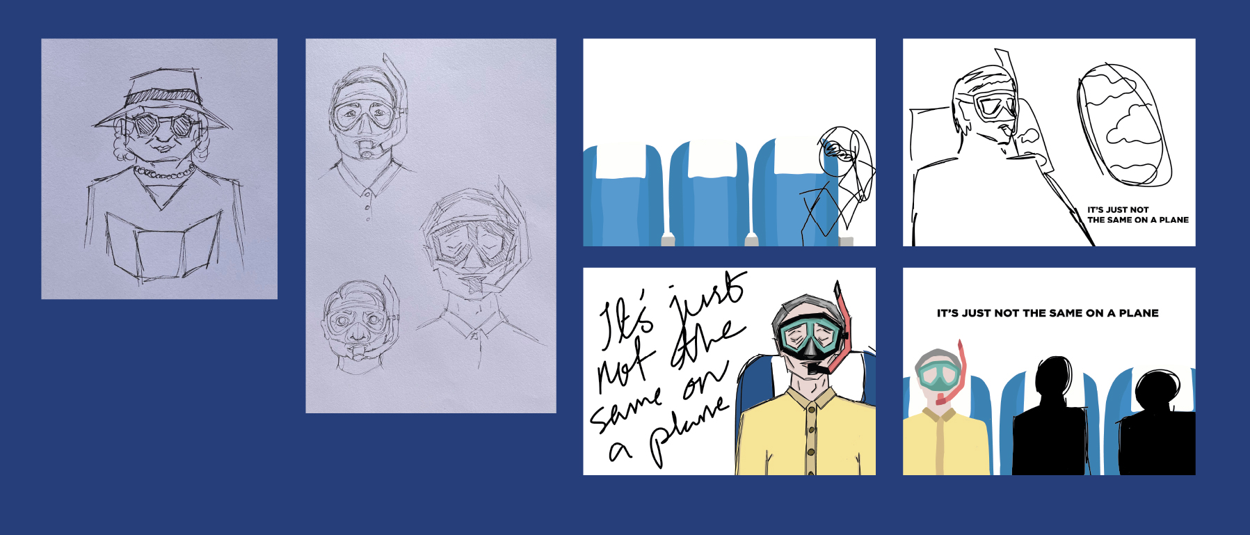
Three postcards, all with the same back. These were made in Illustrator and since I didn't have a drawing tablet or a pen for my touch-screen laptop at the time, I would sit and colour in areas with my finger. Do not recommend.
The idea behind the campaign is that as the Spirit of Tasmania doesn't have any direct competitors, the competition becomes flying instead of taking the ferry. The campaign is meant to highlight the pros of taking the ferry, and the proposition is dramatized in order to grab the attention of those viewing it.

Sketches
Some of my sketches. I early on settled on a motive for this ad, and so the sketching was more focused on exploring different layouts.