malin bengtsson
Eskilstuna Stadslopp
Developing a graphic identity for Eskilstuna Stadslopp, a quarter marathon that was held in 2021, was one of the first things I did as a graphic designer. The work took place from 2020 to 2021 and included designing a logo and establishing brand elements, building a website, and creating material for the brand's social media accounts as well as print.
Note: Eskilstuna is the name of the city where the race was held, Stadslopp translates to city race
Logo
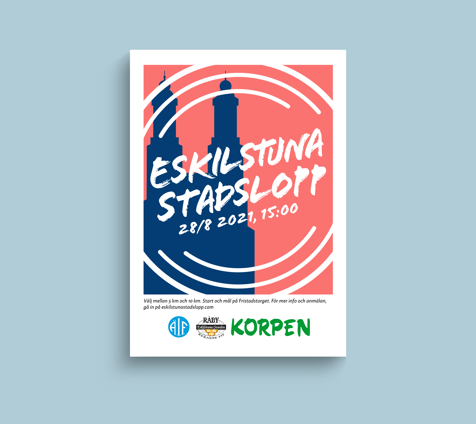
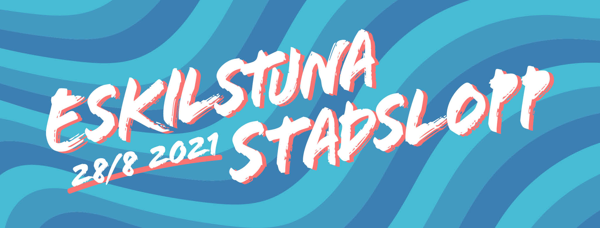
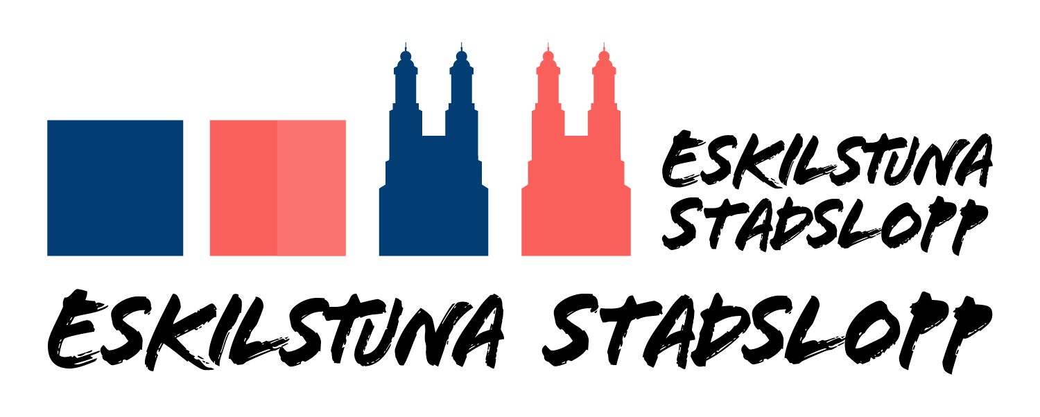
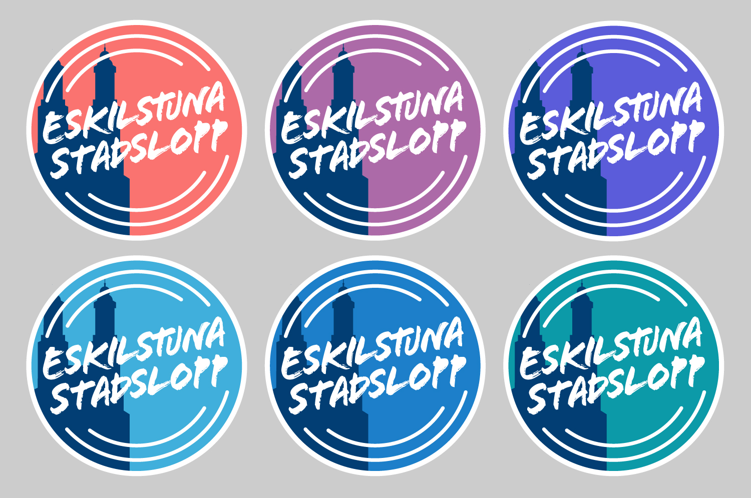
The goal for the logo was for it to represent the city and feel sporty. This resulted in incorporating Klosters kyrka, a church and landmark in central Eskilstuna, as well as circles inspired by running tracks. I early on settled on the font – still can't use Flood for anything else, fun fact – but the colours took a bit more playing around. Eventually I decided on pink and blue, as the contrast brings life to the logo but still works with the white text.
Marketing material
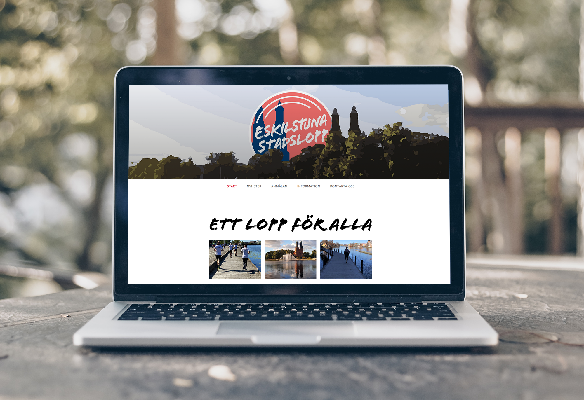
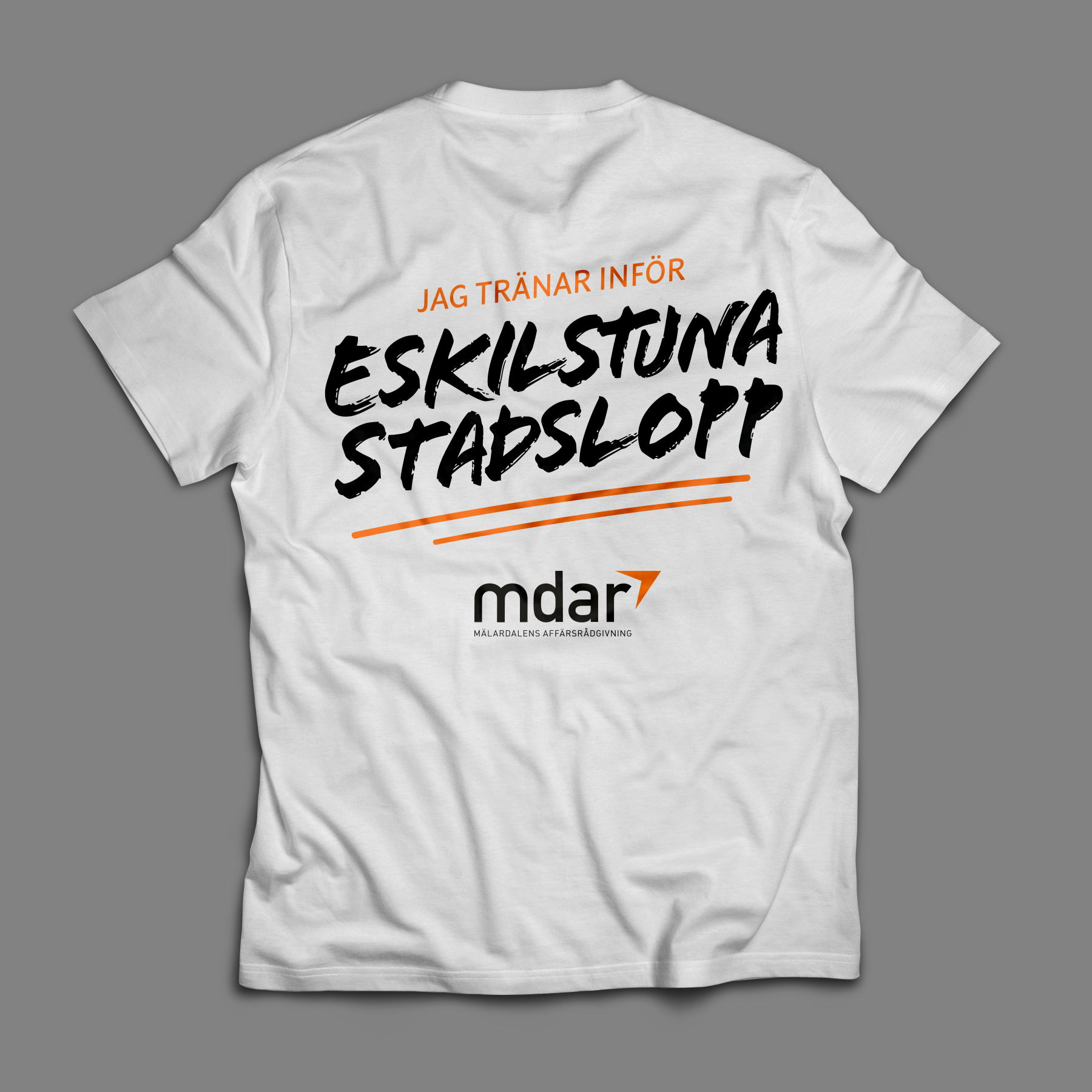
Marketing materials included a WordPress website, Instagram and Facebook posts, a poster, and a t-shirt (in collaboration with MDAR).